Costco Pro Photo Lab
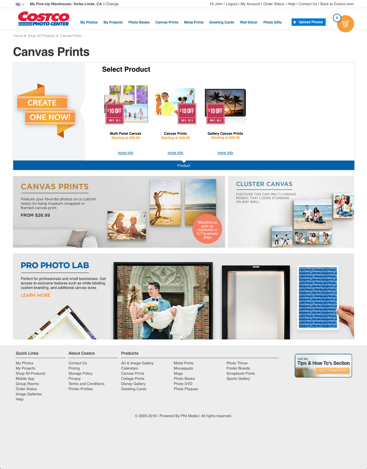
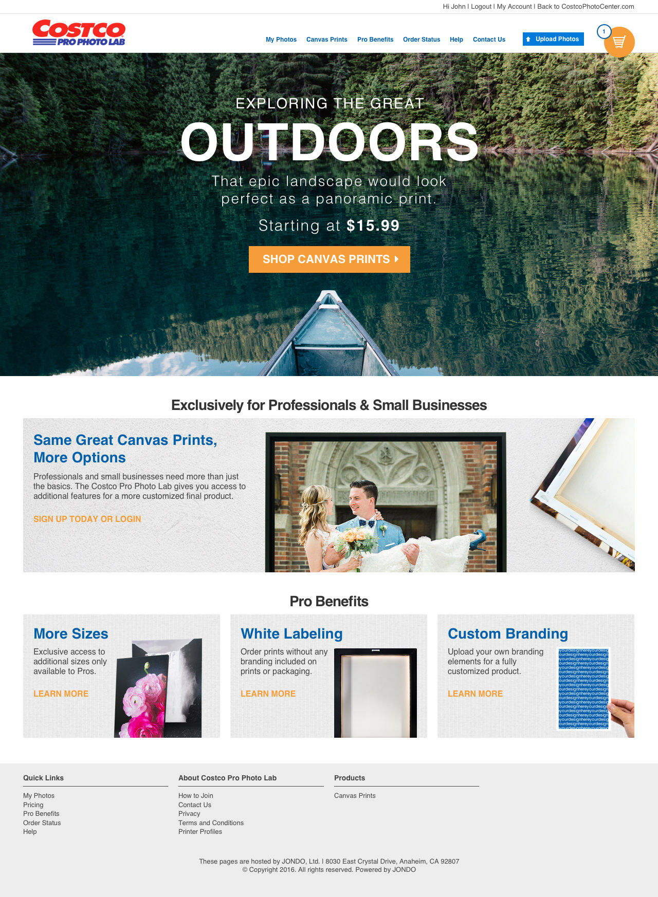
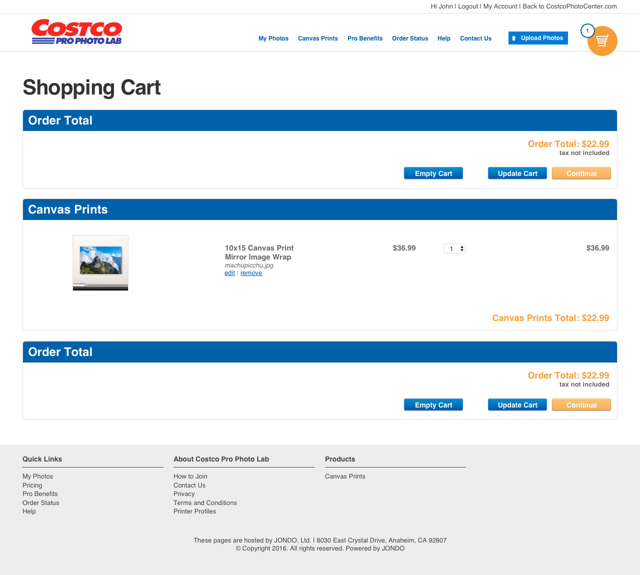
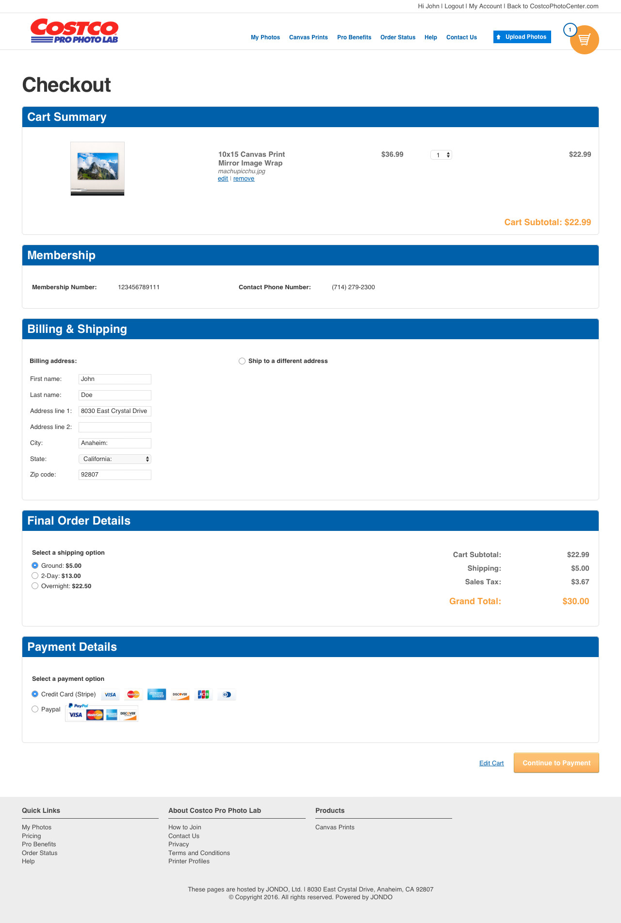
This is a high fidelity prototype I worked on for JONDO that was used in discussions with Costco. The idea was to create a functioning website prototype to illustrate to Costco how a “Pro Photo Lab” that linked out from the Costco Photo Center website would function. Careful consideration was given in this prototype to maintain Costco Photo Center’s branding and styles such as through the header, footer, color palette, and buttons. The designs were built in Sketch and then imported into Invision for prototyping.
View the prototype here,.
Note: Prototype is best viewed on a desktop browser.
Components:
ClientJONDO, CostcoTypeDesign, UI/UXToolsSketch, InvisionYear2016
Initial Research
My team decided from the outset that the appearance of the website should closely resemble that of the Costco Photo Center in order to create a seamless shopping experience. Functionality of the website used existing technology we already had from another proprietary company website.
Having this established workflow and branding style on which to base the Costco Pro Photo Lab allowed me to go straight to high fidelity designs since I knew that functionally things would not change.
I began by carefully examining the Costco Photo Center’s site styles including things such as fonts, buttons, and placement of objects. I used this as a foundation for building my different page designs.
User Flow
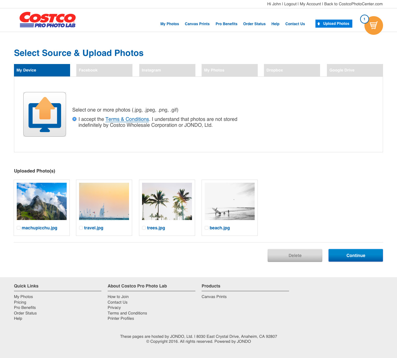
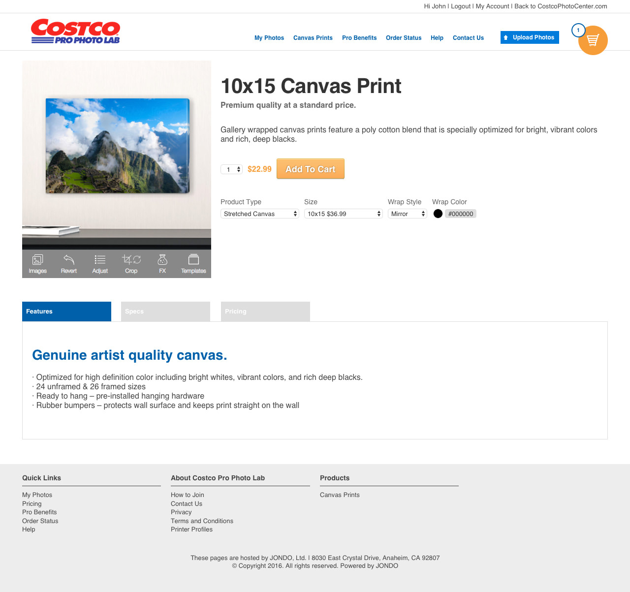
The flow of the final prototype walks the user through the process of ordering a canvas product. This includes landing on the product information page, uploading a photo, editing their product, viewing the cart, and checking out.
Additional Screens
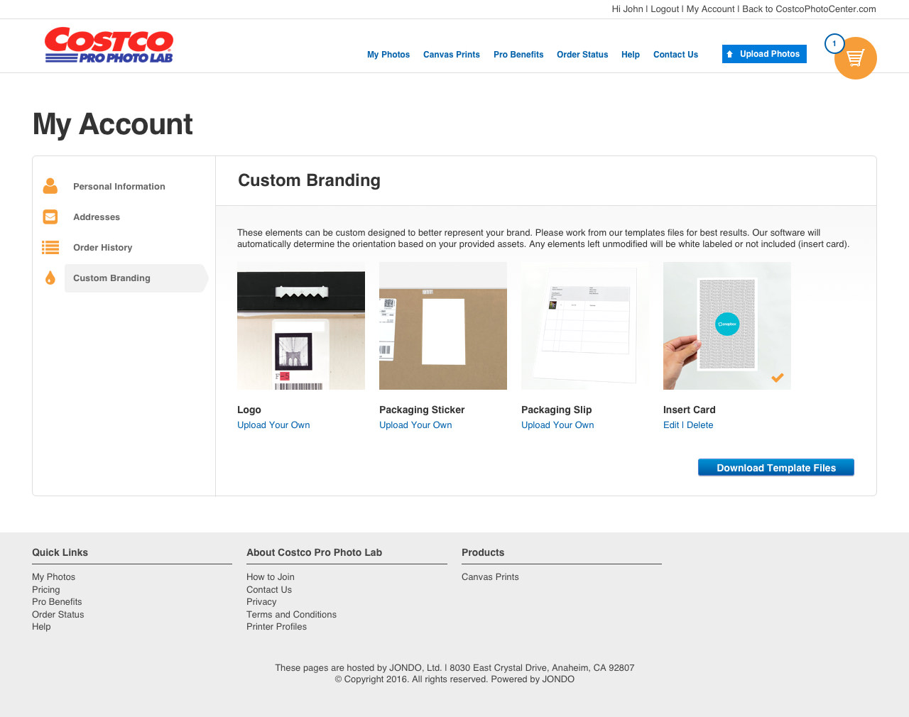
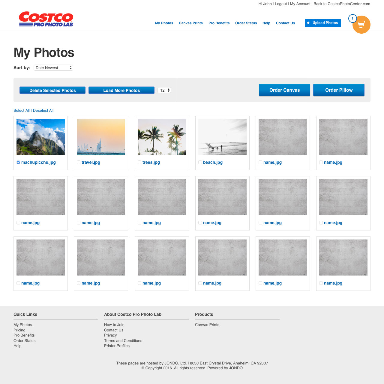
Some additional screens include an Account page (where users can update branding assets) and a “My Photos” page. It was important to design enough pages for a prototype that clearly conveyed the idea we were pitching.

