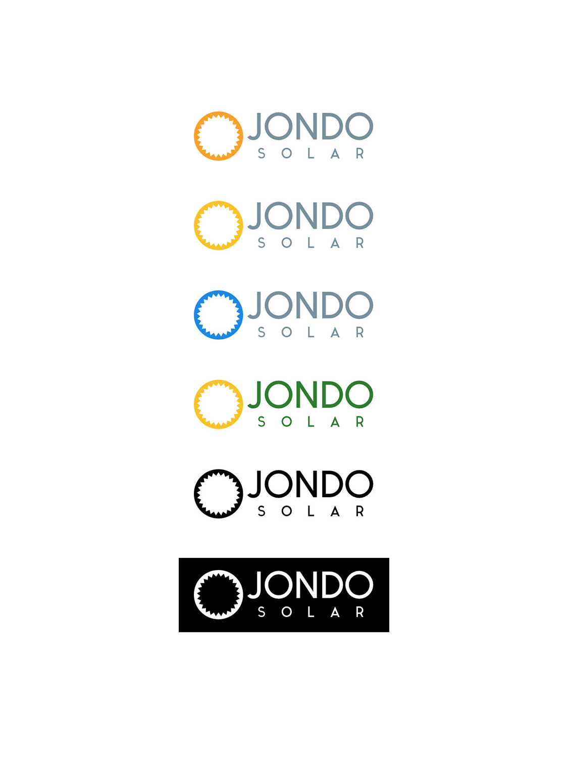
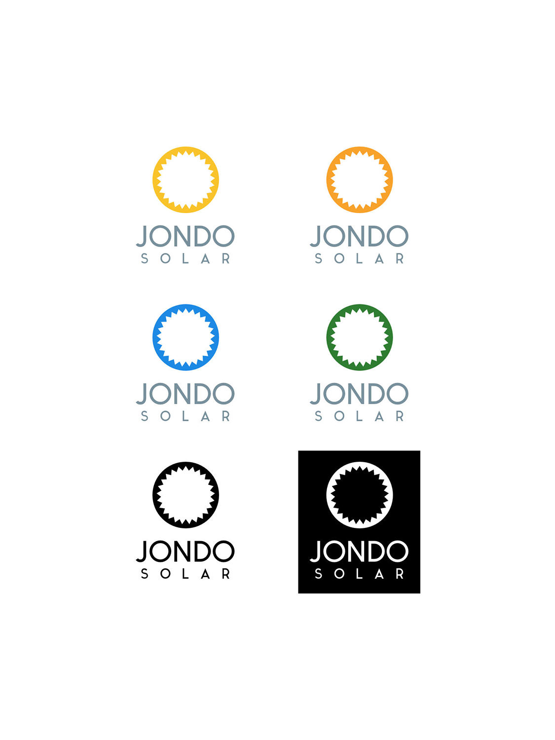
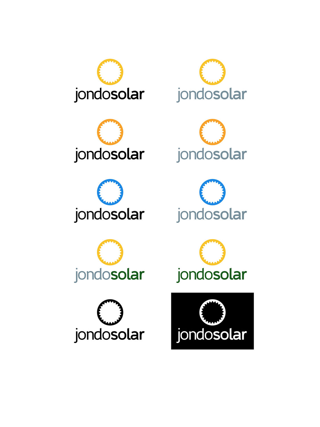
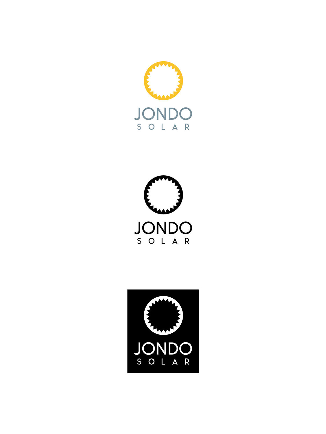
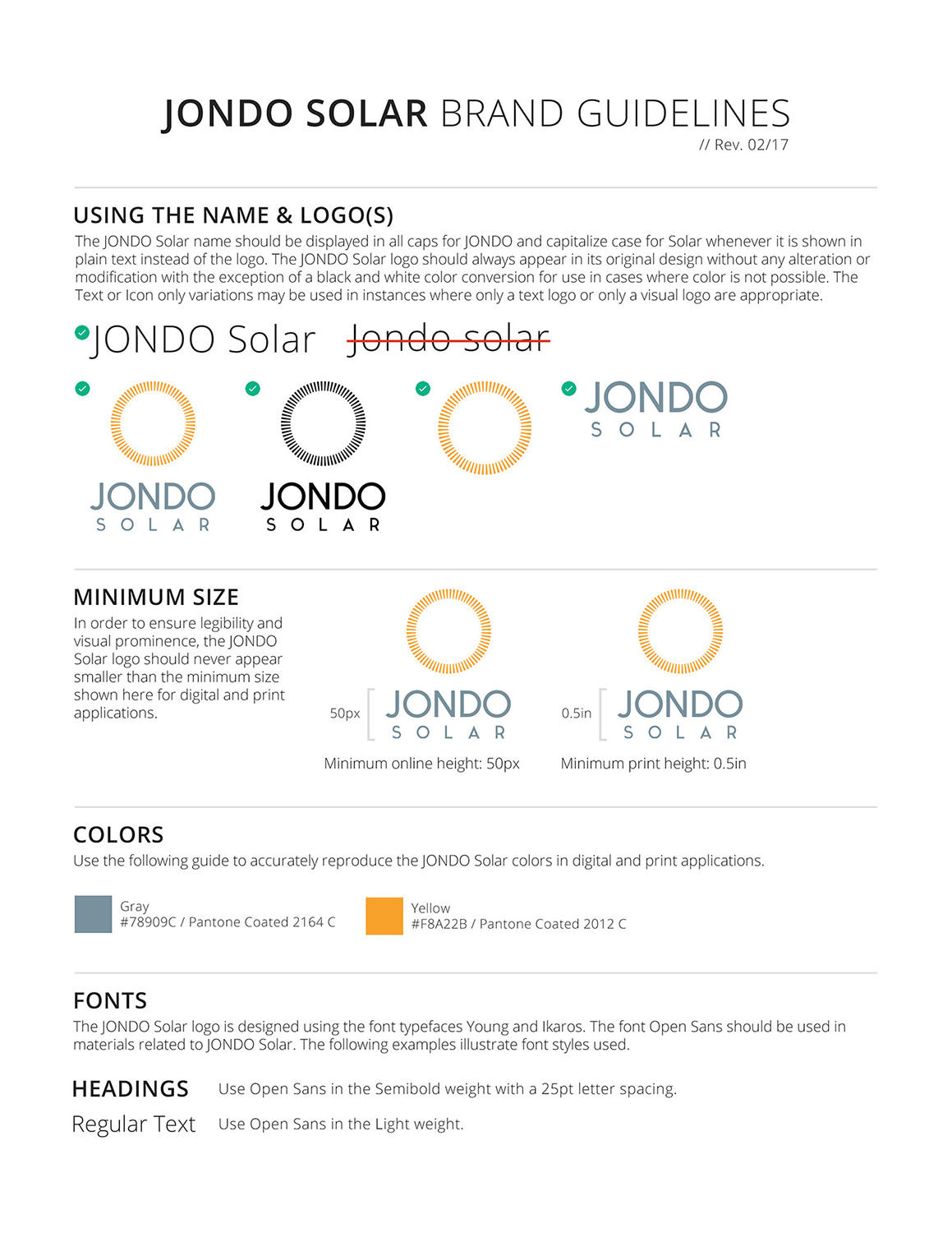
JONDO Solar Logo
I was asked to create a logo for JONDO for its new venture into solar technologies. The design direction intended to evoke the modern simplicity of the original JONDO logo while also being unique enough to differentiate itself as a standalone entity.
ClientJONDOTypeBranding, DesignToolsSketch, Illustrator CCYear2017
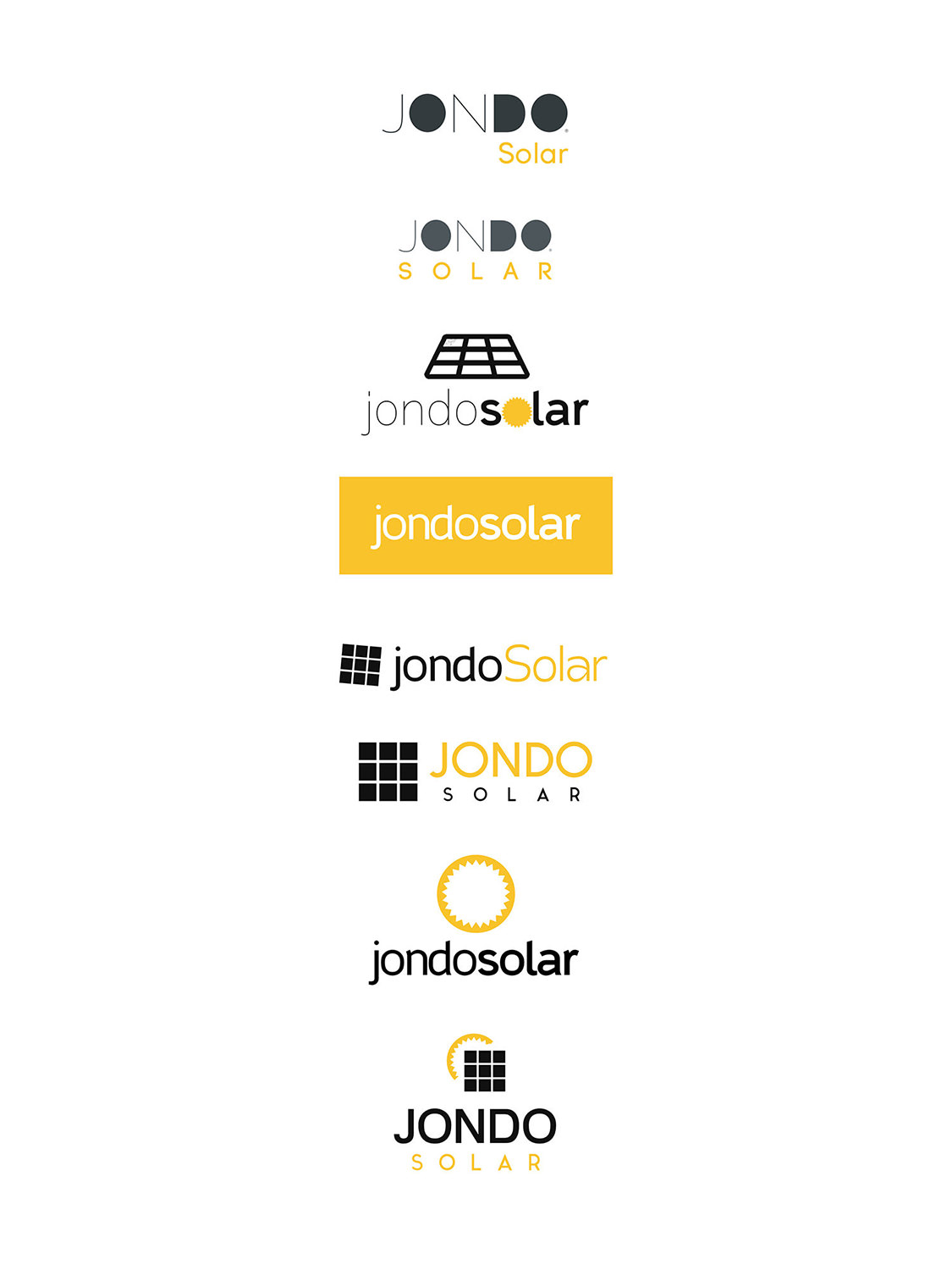
My initial round of logos sought to get a sense of the different directions the logo could take. I experimented with various ways to represent solar and green energy such as through sun rays or solar panels.
Round 2 took the logo styles from round 1 that company stakeholders responded well to and further refined them. In this round I start to explore color more as well.
At the end of the 2nd round of logos, company stakeholders realized a circular logo was the direction they wanted to take. In terms of color they wanted to stick to warm tones. In this 3rd round of logos, I took that feedback into consideration and came up with designs to address those opinions.
We ultimately settled on a simple circle with lines running throughout that call to mind the edges of sun rays. The colors are warm and inviting while the tone of the whole logo is modern and simple.

