eBay Desktop Website Usability
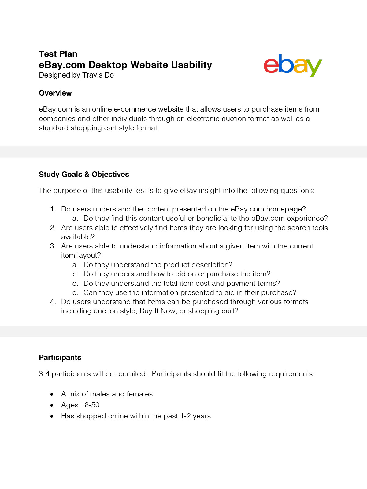
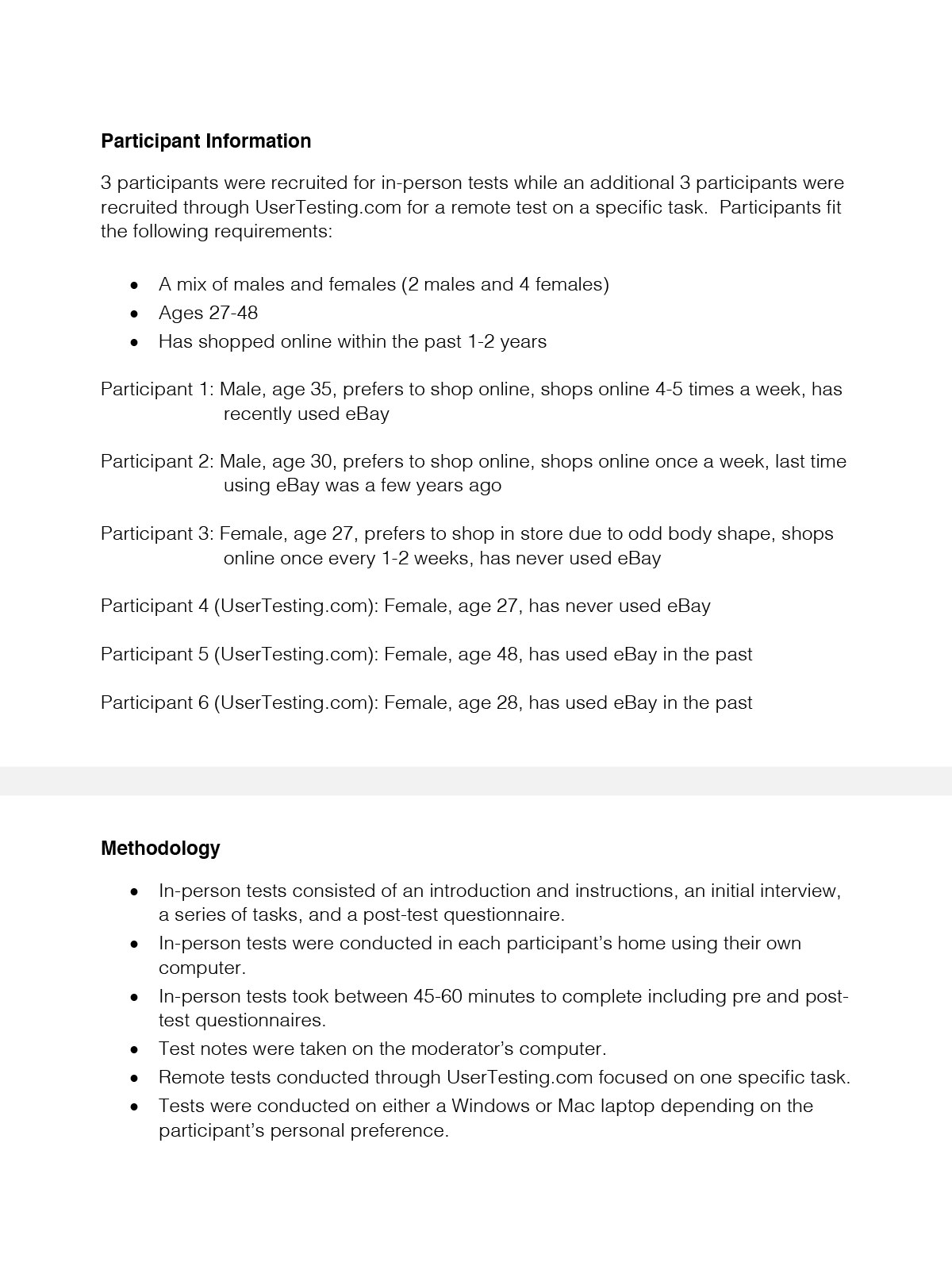
I conducted user research into the usability of eBay’s desktop website including major components such as the homepage, search tools, item layout, and purchase options. 3 in person interviews were conducted and 3 online tests were conducted via UserTesting.com.
Components:
· Study Goals & Objectives
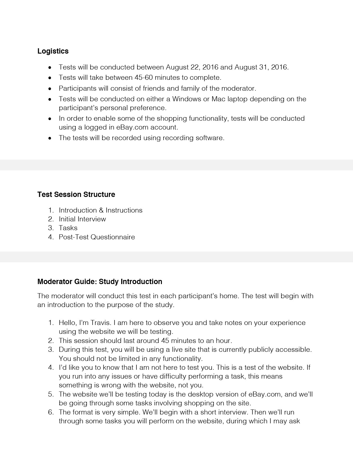
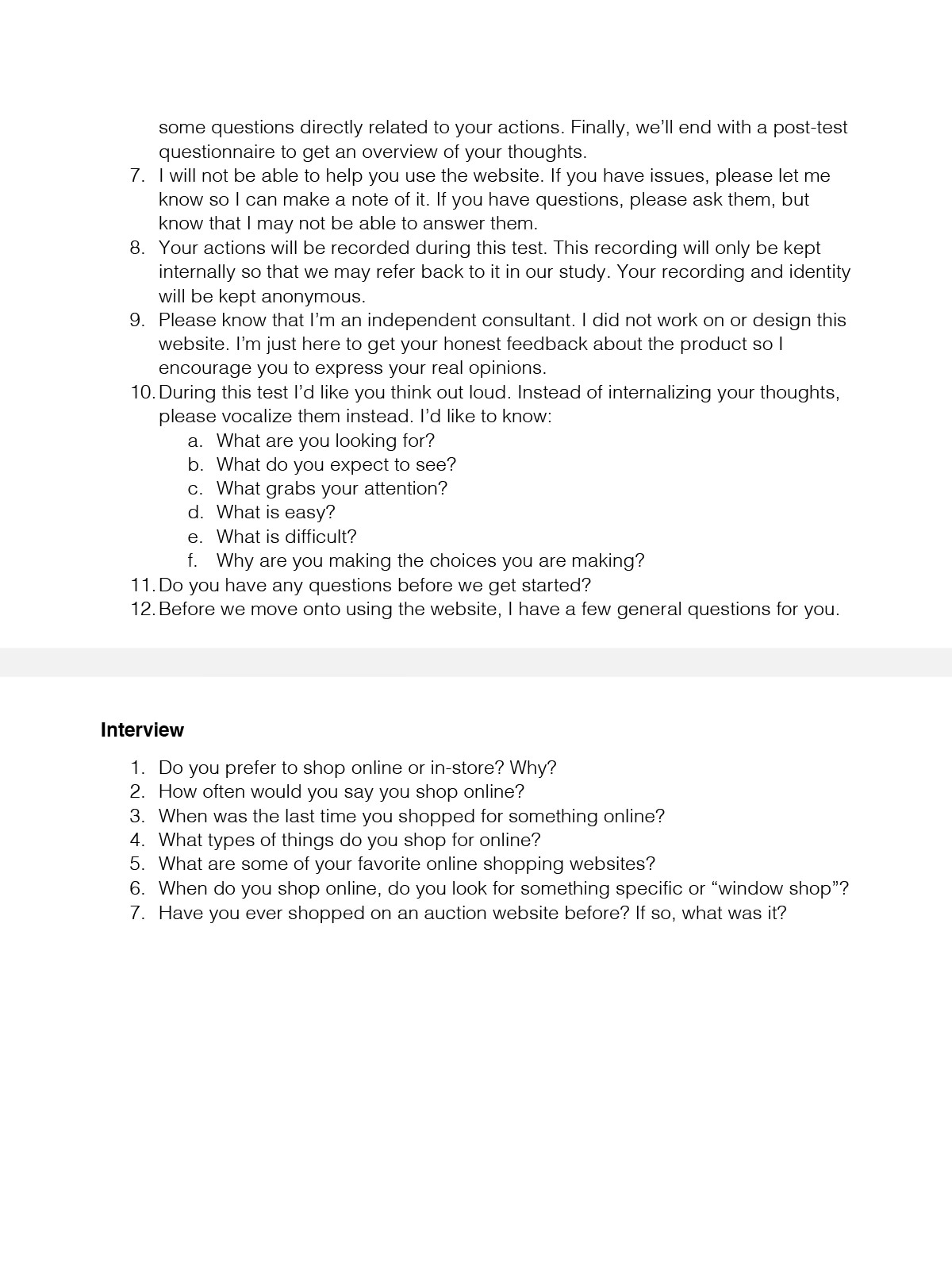
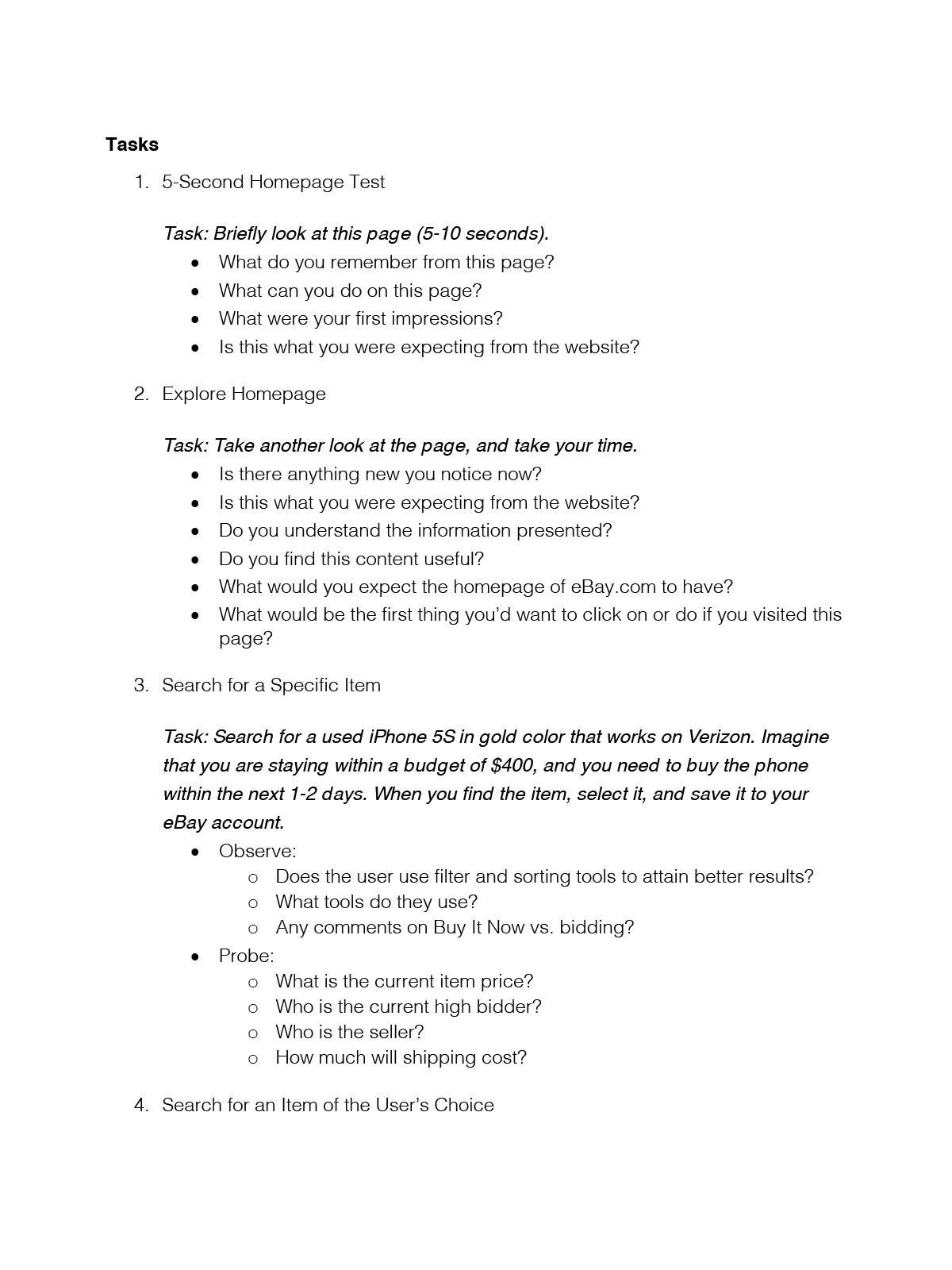
· Moderator Guide
· Usability Report
ClienteBay (Hypothetical)TypeUI/UXToolsGoogle DocsYear2016
Study Goals & Objectives
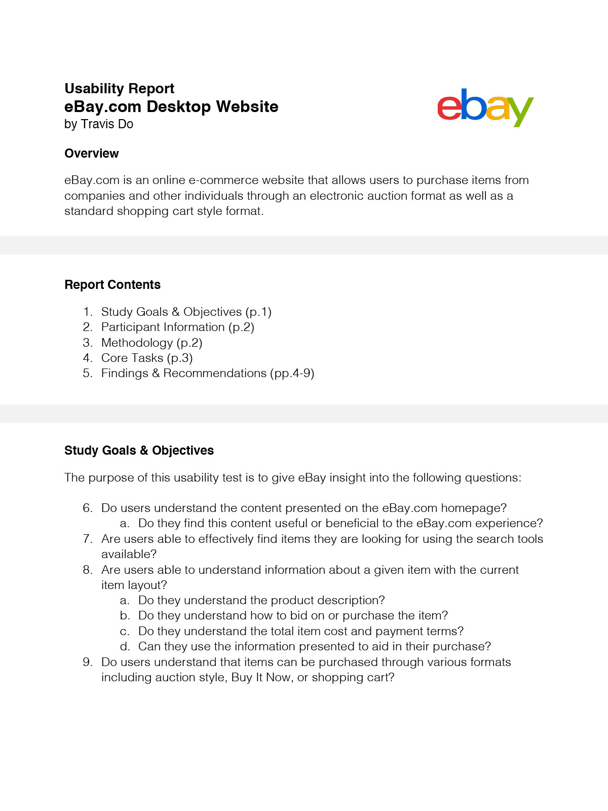
As a very long time user of the eBay platform, I was very curious in how new and more casual users would perceive the platform. I decided to focus my efforts on merely the desktop platform as the mobile website and mobile app experiences vary somewhat. My main objectives focused around core experiences of eBay.com
Moderator Guide
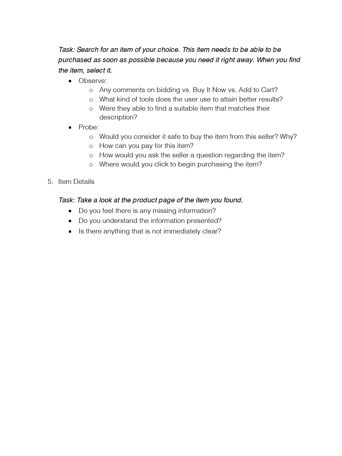
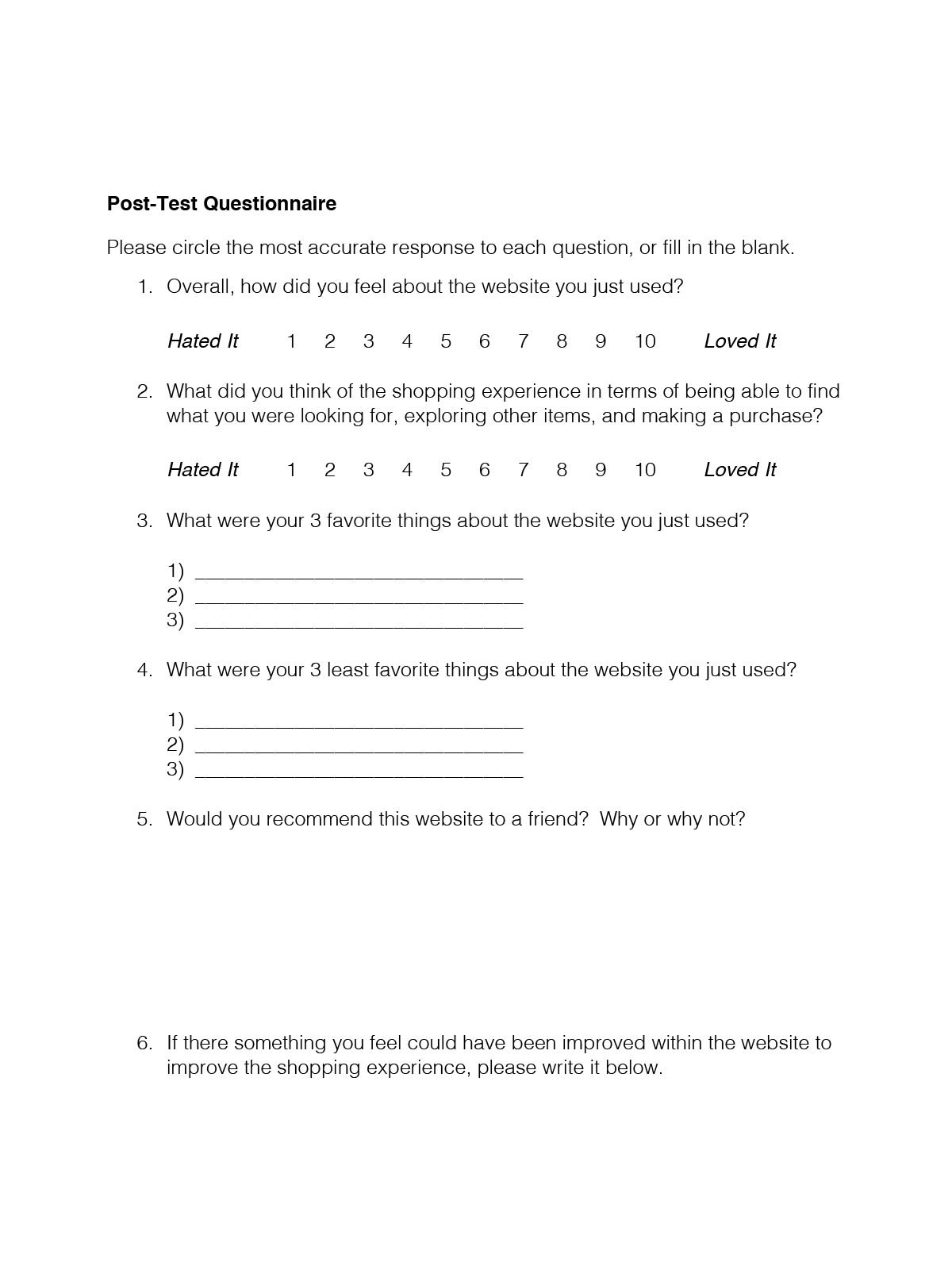
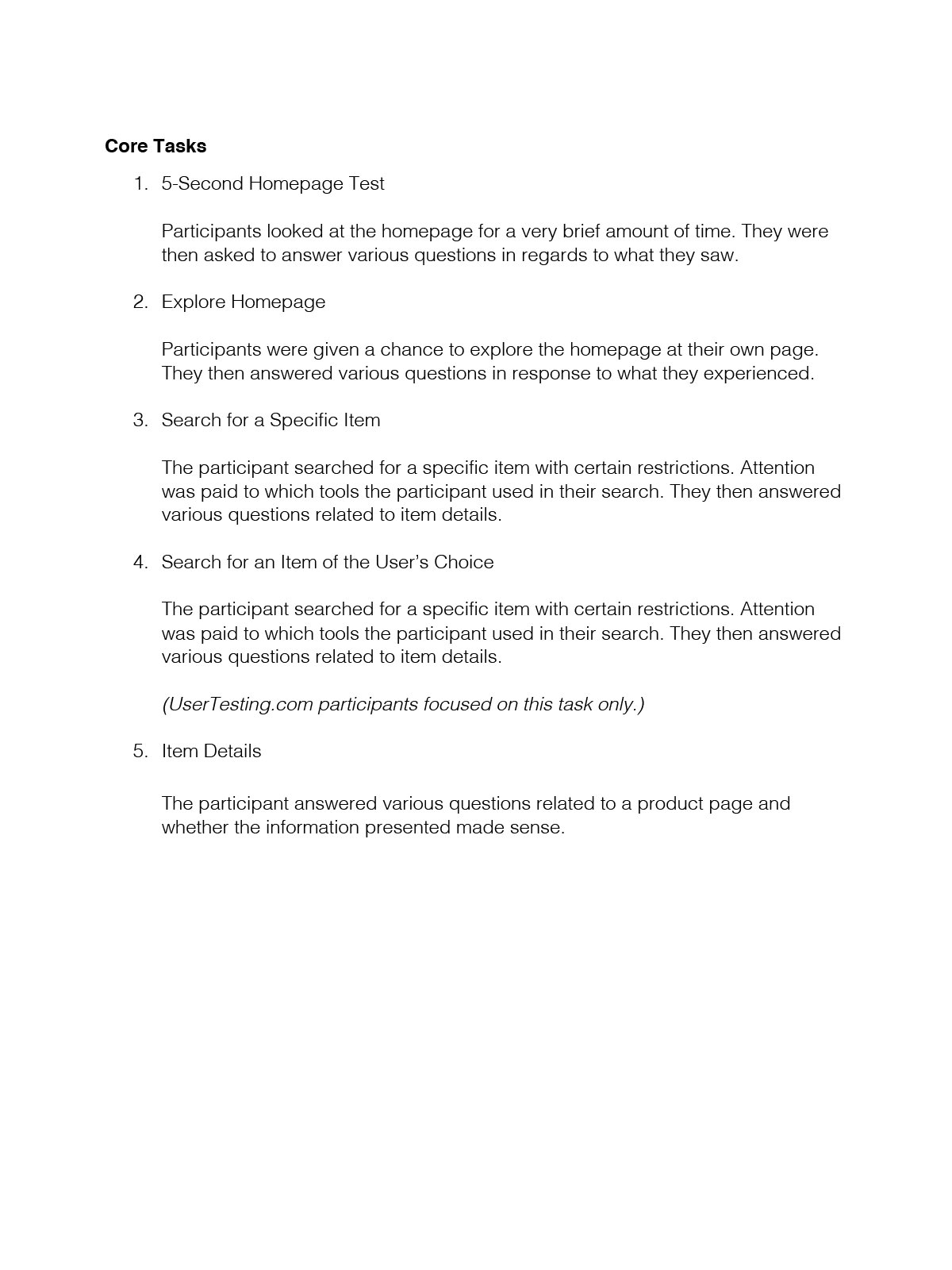
The questions I developed for my guide focus on participants’ shopping habits in order to get a good sense of what kind of shopper they are. The tasks I developed focus around exploring the eBay homepage and searching for and buying specific items. I was curious in how participants would approach the task and what available tools they would use to achieve their task.
Usability Report
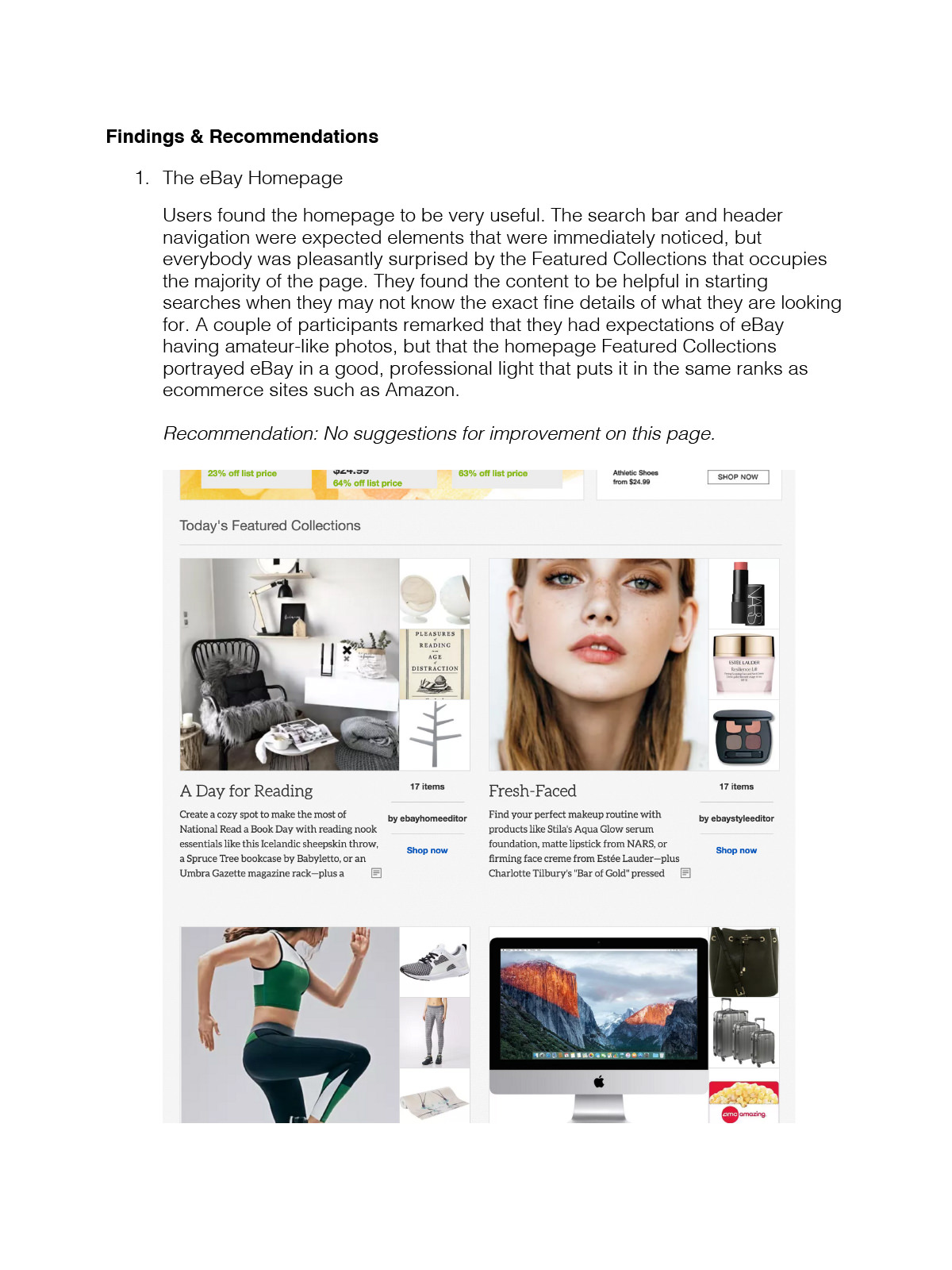
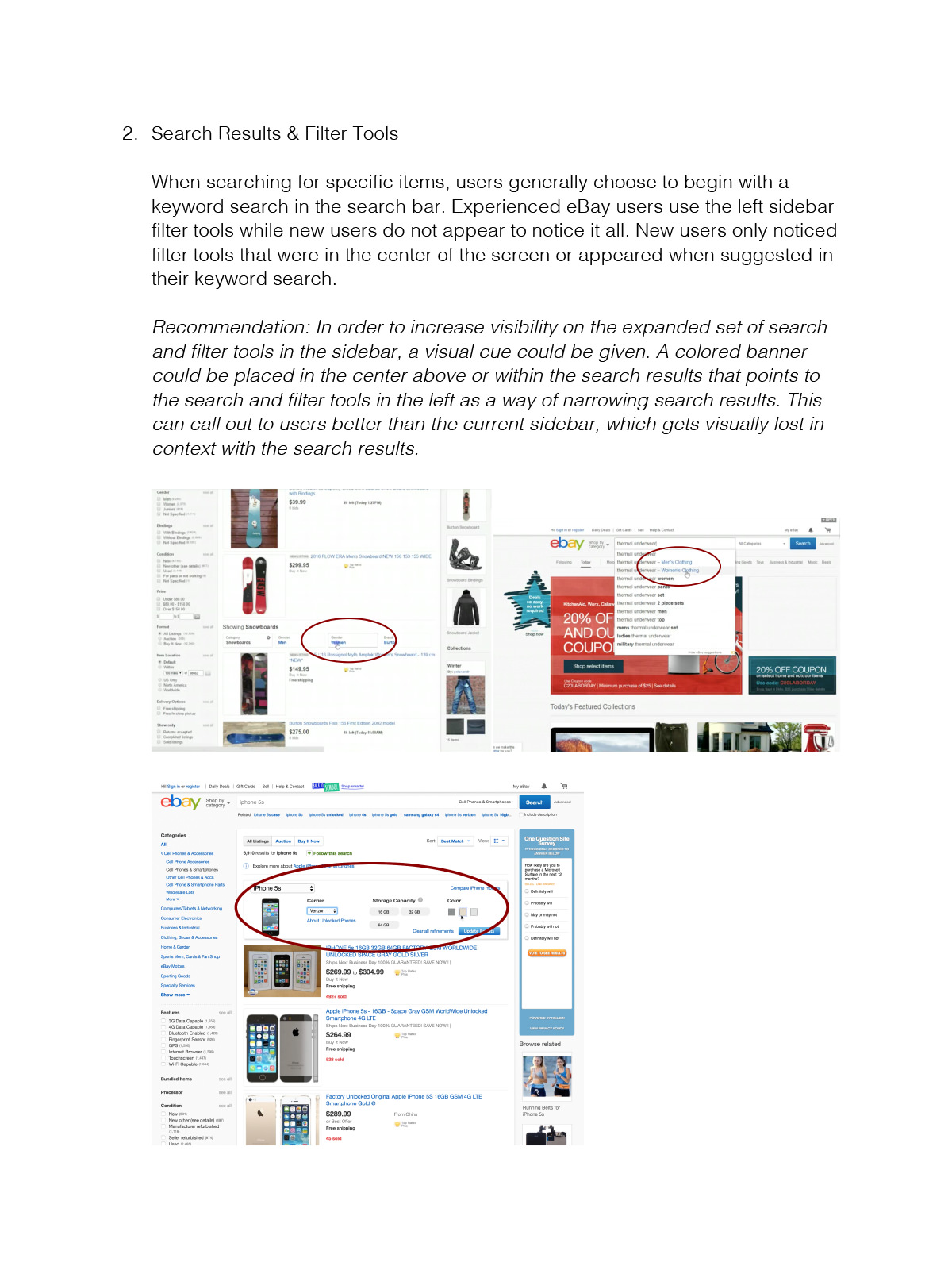
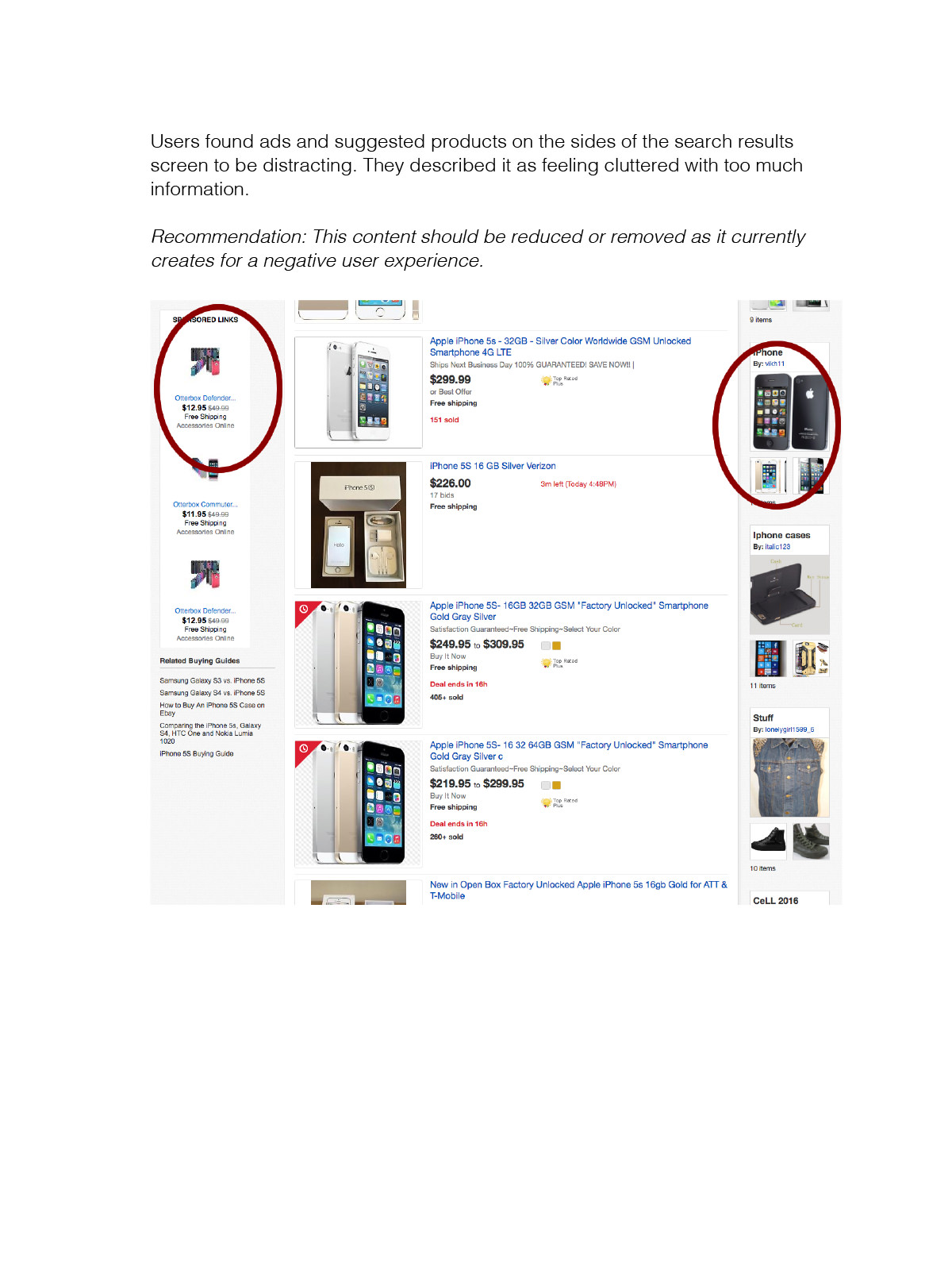
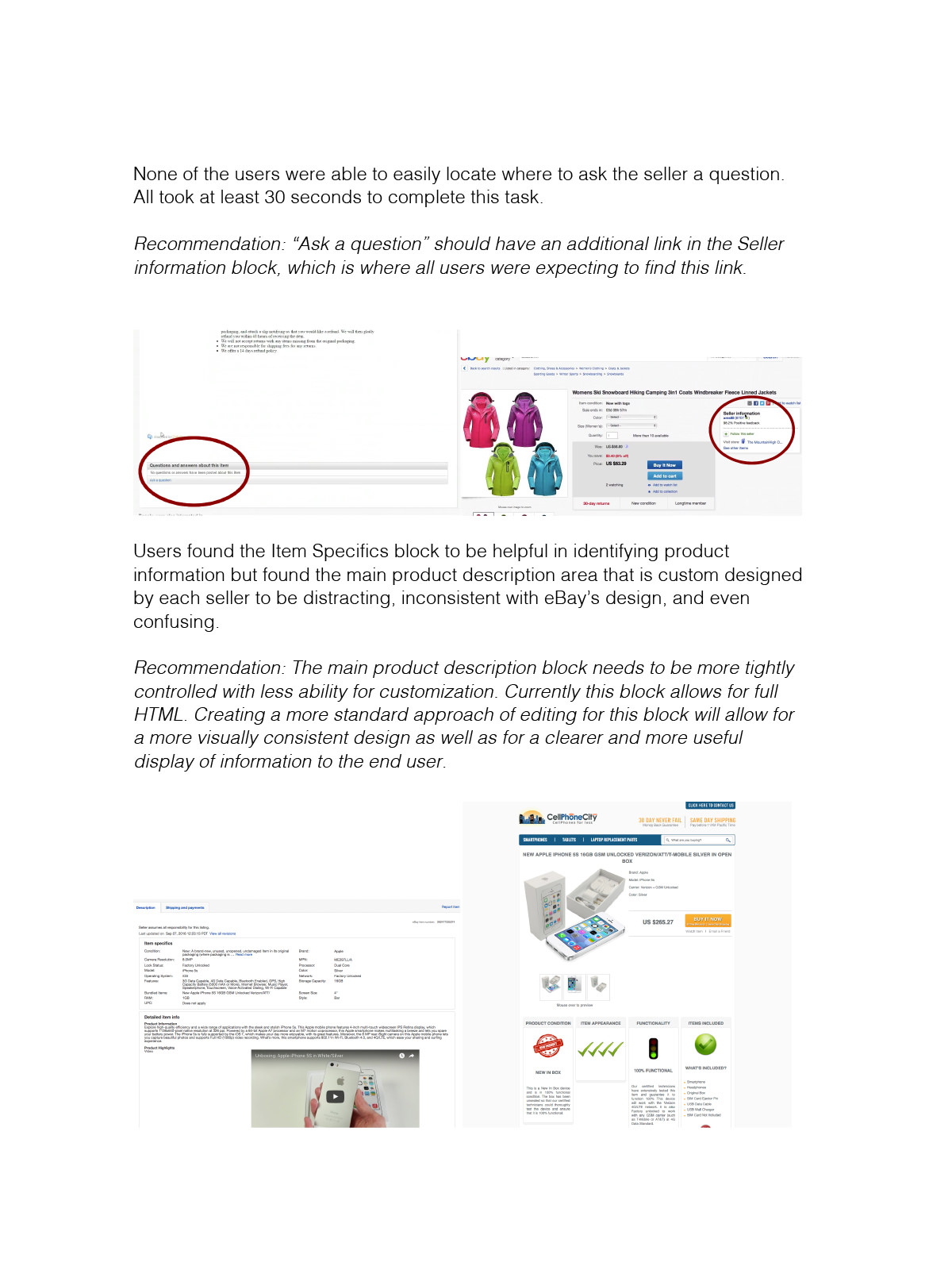
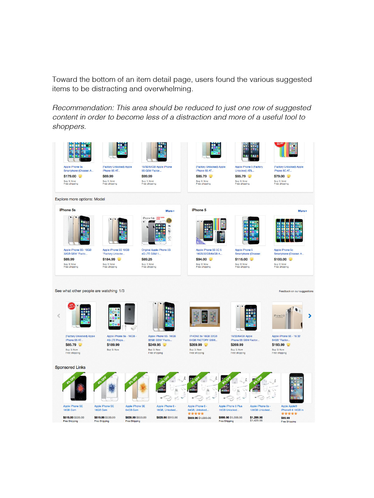
Users generally liked the homepage and found it to be useful. They however disliked certain aspects of the search experience such as distracting ads or unclear placement of information. On a website as large as eBay’s, there will always be room for improvement, and the information gleaned from this study allowed me as the researcher to make recommendations on how to better the experience.

